Client: Syosys
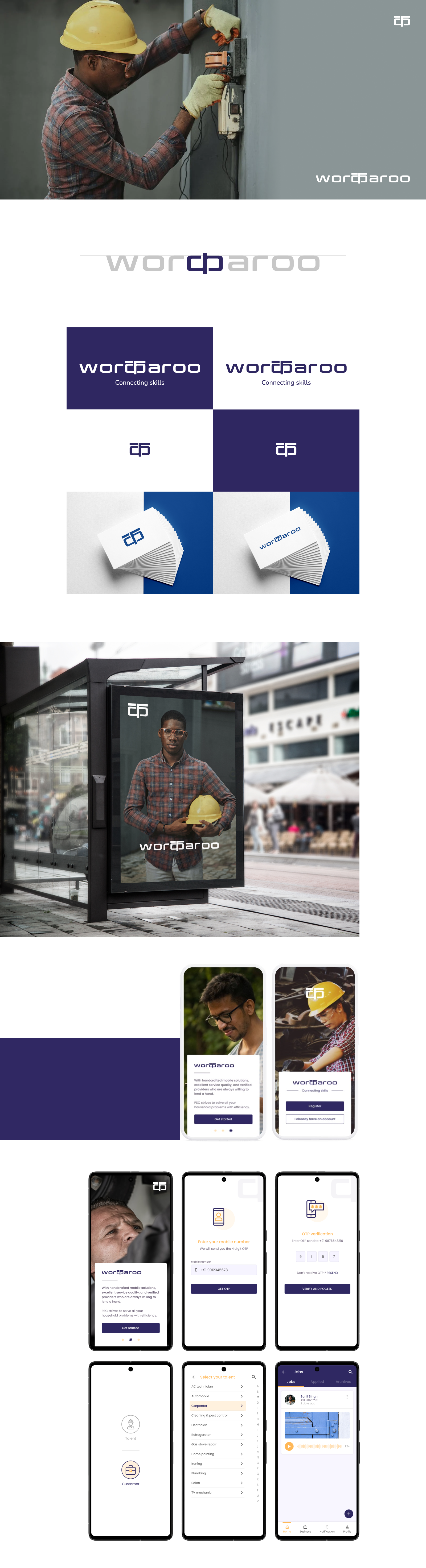
The logo for Workaroo effectively communicates the essence of the brand and leaves a positive and memorable impression on viewers. It considers the specific characteristics and values of the brand and the effective use of the Hindi letter 'क' adds visual balance, creating a cohesive and aesthetically pleasing composition.
The Branding for Workaroo encompasses various elements that work together to create a cohesive and impactful brand identity. Consistency in these visual elements is crucial for building brand recognition. A strong brand identity helps differentiate the brand from competitors and creates a memorable impression.
The Application UI design tries to create an intuitive, user-friendly, and visually appealing experience for application users. Used visual hierarchy to guide users' attention and emphasize important elements. Also employed techniques such as contrasting colors, size variations, and spacing to create a clear visual structure and help users quickly identify and prioritize relevant information.